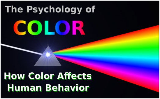
New Delhi: “Colour Express the main Function of a man”- Carl Jung.
Colour plays a vitally important role in the world in which we live. Colour can sway thinking, change actions, and cause reactions. It can irritate or soothe your eyes, raise your blood pressure or suppress your appetite.
Artists and interior designers feel that colours are influential communication tools and can be used to cause physiological reactions. As a matter of fact, our feeling about any colour is deeply personal and rooted in our own experience or culture. For example, while the colour white is used in many countries to represent purity and virtue, it is seen as a symbol of grief in some countries.
Colour Psychology:
The psychology of colour is based on the mental and emotional effects colours have on sighted people in all facets of life. There are some very subjective pieces to colour psychology as well as some more accepted and proven elements. There will also be variations in interpretation, meaning, and perception between different cultures.
The Meaning of Colours We Choose:
Carl Jung, a renowned psychiatrist and proponent of art therapy, encouraged his patients to use colour because he felt this would help them express some of the deeper parts of their psyche. It is believed that the colour choices you make reflect a deeper meaning about your personality traits. For example, introverts and extroverts are likely to choose different colours – blue and red respectively.
The colours you choose to wear might also say something about how you are feeling that day. Some days you may feel like wearing something lighter, something red, or something blue. These choices are often a reflection of how you are feeling at the moment. Additionally, wearing certain colours may cause you to react differently to certain situations.
How Do We See Colour?
There are 2 main sources of light that create the colours we see: the sun and light bulbs. As you know, the light from the sun allows us to see things during the day as well as during the night when the sun’s light reflects off the moon. There is a visible spectrum of colours that we can see in addition to the combination of all colours (white) and the absence of colour (black).
Surfaces reflect and absorb light differently, which results in the colours we see through our eyes. For example, a tomato absorbs all light on the spectrum except the red rays of light. The red rays of light are reflected off the surface of the tomato which then reaches our eyes for processing.
The coloured light enters the eye through the pupil, goes through the lens, then reaches the back of the eye called the retina. On the retina there are a bunch of light sensors called rods and cones. These rods and cones send a signal to the brain about what the eye is seeing. The cones are capable of seeing three colours: red, green, and blue. These are known as primary colours (RGB Model).
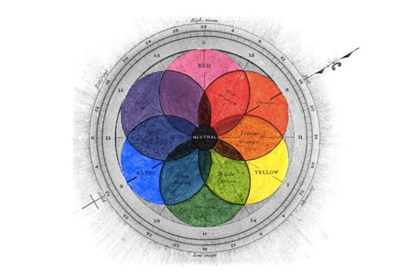
The Traditional Colour Wheel – Primary, Secondary, and Tertiary Colours:
Primary Colours (Traditional RYB Model):
Primary colours consist of red, yellow, and blue. These 3 hues cannot be mixed or formed by any combination of other colours. Additionally, all other colours are created by mixing these three colours.
Secondary Colours:
Secondsary colours consist of green, orange and purple (violet). Secondary colours are formed by mixing 2 primary colours.
Tertiary Colours:
Tertairy colours consiste of red-orange, yellow-orange, yellow-green, blue-green, blue-violet, and red-violet. Tertiary colours are formed by mixing primary and secondary colours, resulting in the two-word names.
Colour Symbolism:
Colour symbolism is the use of colour as a representation or meaning of something that is usually specific to a particular culture or society. Context, culture and time are certainly important factors to consider when thinking about colour symbolism
Colour Meanings of Primary and Secondary Colours:
1. RED: The most emotionally intense colour, red stimulates a faster heartbeat and breathing. It is also the colour of love. Since it is an extreme colour, red clothing might not help people in negotiations or confrontations. Its effect is physical; it stimulates us and raises the pulse rate, giving the impression that time is passing faster than it is. It relates to the masculine principle and can activate the "fight or flight" instinct.
Cultural Colour Symbolism & Meanings of Red:
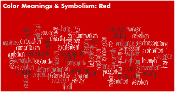
China & India: good luck, used in dresses, chair, parasol, cup lace, firecrackers in a wedding
Russia & China: revolution, communism
Mayas: south
England: buses, phone booths
Spain: bull fighting, flamenco dresses
2. ORANGE: Since it is a combination of red and yellow, orange is stimulating and reaction to it is a combination of the physical and the emotional. If your gut had a colour, it’d be orange. Studies have proven that orange colour enhances concentration and gives the brain and nervous system a ‘wake-up call’. Like red, when walking into an orange room you immediately feel an overall increase in energy. However, too much of orange can cause fatigue. It is also beneficial for speeding up metabolism and is a common food colour. Add an orange bracelet or belt to enhance your playfulness factor and warm up the room on days when you want to be the life of the office party.
Cultural Colour Symbolism & Meanings of Orange:
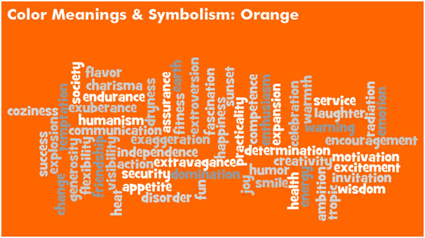
Buddhism: humility, renunciation, desirelessness
China & Japan: love, happiness, plenitude
Other: treason, Halloween
3. YELLOW: Have you ever wondered why Smiley is yellow? The reason is that yellow helps to release a chemical in the brain called Serotonin, essential for causing a happy mood. Use it to boost confidence and enhance optimism — and, of course, to add a dash of sunshiny liveliness. While it is considered an optimistic colour, people lose their tempers more often in yellow rooms. Yellow also activates the anxiety portion of our brains and thus can ignite crying in babies and encourage fighting. It is the most difficult colour for the eye to take in, so it can be overpowering if overused.
Cultural Colour Symbolism & Meanings of Yellow:
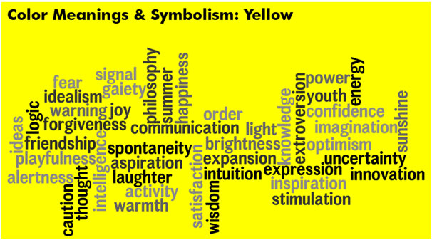
Egypt: happiness, prosperity
China: Imperial colour to worship, the sky
Futbol: yellow card, warning
Other: truth
4. GREEN: Currently the most popular decorating colour, green symbolizes nature. Green is the easiest colour on the eye, as it demands no ocular adjustment and it can actually reduce fatigue, making it the colour of rest and relaxation. Researchers have proven that the colour improves vision. This could be the reason why classroom boards are in green colour. Clean greens are fresh and vibrant while olive and muted tones can be depressing. Pastel greens can feel relaxing and bright yellow-greens are energetic but can be overwhelming.
Cultural Colour Symbolism & Meanings of Green
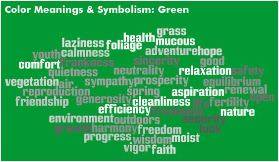
Islam: Allah in nature
Northern Europe: The Green Man
5. BLUE: The psychological effects of the colour blue are probably universal. Almost everyone enjoys looking into a blue sky and across a lake or the sea because there is something calming about the vastness of blue. It appears to free the mind. Blue is the colour of the mind; no wonder it is such a dominant business colour. Blue can also be cold and depressing. Fashion consultants recommend wearing blue to job interviews because it symbolizes loyalty. People are more productive in blue rooms. Time and again in research, blue is the world's favourite colour. However, it can be perceived as cold, unemotional and unfriendly. Avoid using this colour in the living room, kitchen or other rooms where you tend to be more active.
Cultural Colour Symbolism & Meanings of Blue:
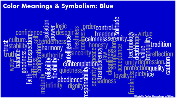
Catholicism: Virgin Mary, God Father
Islam: Mosque decorations
UN Flag: peace, cooperation
India: mercy
Jewish: Holiness
Other than the primary Colours:
Black: Black signifies power and authority, it represents knowledge and intelligence. It is the most popular colour in the fashion industry because of its association with style and it makes people wearing it look thin. Black outfits can also be overpowering, or make the wearer seem aloof or evil. It creates protective barriers, as it absorbs all the energy coming towards you, and it enshrouds the personality. Black is essentially an absence of light, since no wavelengths are reflected and it can, therefore be menacing. Positively, it communicates absolute clarity, with no fine nuances.
White: White is popular in decorating and in fashion because it is light, neutral, and goes with everything. Just as black is total absorption, so white is total reflection. In effect, it reflects the full force of the spectrum into our eyes. Thus it also creates barriers, but differently from black, and it is often a strain to look at. Baby products come usually in white to symbolize innocence and cleanliness. White is used by doctors and nurses to show sterility. A research showed that people having hand tremors didn’t shake much in white rooms proving that the colour has a calming effect.
Applying Colour Psychology to Everday Life:
Did you know your surroundings may be influencing your emotions and state of mind? Do you ever notice that certain places especially irritate you? Or that certain places are especially relaxing and calming? Well, there’s a good chance that the colours in those spaces are playing a part.
In art therapy, colour is often associated with a person’s emotions. Colour may also influence a person’s mental or physical state. For example, studies have shown that some people looking at the colour red resulted in an increased heart rate, which then led to additional adrenaline being pumped into the blood stream.
The concepts of colour psychology can also be applied in everyday life. For example, maybe you’re planning on re-painting your walls or redecorating a house or room with a new colour scheme. Well, you might want to consider some of these suggestions about colours and how they might affect your emotions and mood.
There are also commonly noted psychological effects of colour as it relates to two main categories: warm and cool.
Psychological Effects of Cool Colours:
Cool colours – such as green, blue and purple – often spark feelings of calmness as well as sadness.
Need to be creative? Want help getting those brain synapses firing? Try utilizing the colour purple. Purple utilizes both red and blue to provide a nice balance between stimulation and serenity that is supposed to encourage creativity. Light purple is said to result in a peaceful surrounding, thus relieving tension. These could be great colours for a home or business office.
Are you looking for a peaceful and calming environment? You might consider using green and/or blue then. These cool colours are typically considered restful. There is actually a bit of scientific logic applied to this – because the eye focuses the colour green directly on the retina, it is said to be less strainful on your eye muscles.
The colour blue is suggested for high-traffic rooms or rooms that you or other people will spend significant amounts of time. Another cool colour, blue is typically a calming and serene colour, said to decrease respiration and lower blood pressure. The bedroom is a great place to use these colours as they should help you relax.
Psychological Effects of Warm Colours:
Warm colours – such as red, yellow and orange – can spark a variety of emotions ranging from comfort and warmth to hostility and anger.
Want to create an environment of stimulation or whet people’s appetite? You might consider utilizing the colours yellow or orange. These colours are often associated with food and can cause your tummy to growl a little. Have you ever wondered why so many restaurants use these colours?
You do want to be careful about using bright colours like orange and especially yellow. They reflect more light and excessively stimulate a person’s eyes which can lead to irritation. You also probably don’t want to paint your dining room or kitchen these colours if you’re a calorie-counter.
Impact of Colour on Human and Everyday Life:
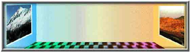
Our personal and cultural associations affect our experience of colour. Colours are seen as warm or cool mainly because of long-held (and often universal) associations. Yellow, orange and red are associated with the heat of sun and fire; blue, green and violet with the coolness of leaves, sea and the sky. Warm colours seem closer to the viewer than cool colours, but vivid cool colours can overwhelm light and subtle warm colours. Using warm colours for foreground and cool colours for background enhances the perception of depth.
Although red, yellow and orange are in general considered high-arousal colours and blue, green and most violets are low-arousal hues, the brilliance, darkness and lightness of a colour can alter the psychological message. While a light blue-green appears to be tranquil, wet and cool, a brilliant turquoise, often associated with a lush tropical ocean setting, will be more exciting to the eye. The psychological association of a colour is often more meaningful than the visual experience.
Colours act upon the body as well as the mind. Red has been shown to stimulate the senses and raise the blood pressure, while blue has the opposite effect and calms the mind.
People will actually gamble more and make riskier bets when seated under a red light as opposed to a blue light. That's why Las Vegas is the city of red neon.
For most people, one of the first decisions of the day concerns colour harmony. What am I going to wear? This question is answered not only by choosing a style and fabric appropriate to the season, but by making the right colour choices. And it goes on from there. Whether you're designing a new kitchen, wrapping a present or creating a bar chart, the colours you choose greatly affect your final results.
How often have you caught your breath at the sight of a flowerbed in full bloom? Most likely the gardener has arranged the flowers according to their colour for extra vibrancy. Have you ever seen a movie in which a coordinated colour scheme helps the film create a world unto itself? With a little knowledge of good colour relationships, you can make colours work better for you in your business graphics and other applications.
Colour Activity:
Colour is light and light is energy. Scientists have found that actual physiological changes take place in human beings when they are exposed to certain colours. Colours can stimulate, excite, depress, tranquilize, increase appetite and create a feeling of warmth or coolness. This is known as chromodynamics.
An executive for a paint company received complaints from workers in a blue office that the office was too cold. When the offices were painted a warm peach, the sweaters came off even though the temperature had not changed.
The illusions discussed below will show you that sometimes combinations of colours can deceive the viewer, sometimes in ways that work to your advantage. They can also cause unfortunate effects in your graphics, so be sure to watch out for these little traps.
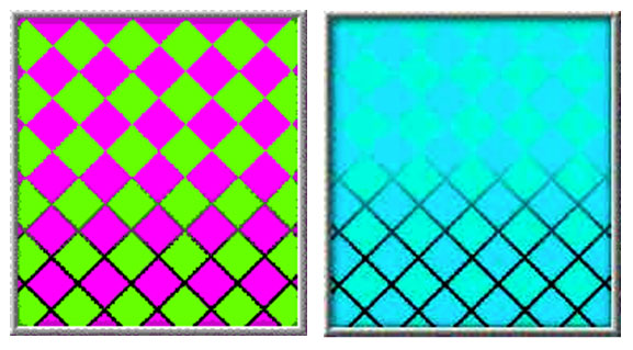
Sometimes colours affect each other in unexpected ways. For example, most colours, when placed next to their complements, produce vibrating, electric effects. Other colours, in the right combinations, seem quite different from what you'd expect.
The most striking colour illusions are those where identical colours, when surrounded by different backgrounds, appear to be different from each other. In a related effect, different colours can appear to be the same colour when surrounded by certain backgrounds.
When you look at a coloured object, your brain determines its colour in the context of the surrounding colours.
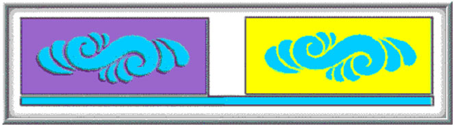
In this picture, the two bows are the same colour, but because the surrounding areas are strikingly different in contrast, it seems to our eyes that they are different. Keep this effect in mind when creating graphics where colour matching is critical. If you attempt to match your corporation's official colours, you may find that even if you achieve an exact match, it may look wrong in context.
In the same way that one colour can appear different in different surroundings, two similar colours may appear to be identical under some conditions. Even though the two symbols are actually slightly different tones, the contrasting backgrounds cause our brains to think that they are the same colour. This effect is harder to control, but be aware of it because it can affect your graphics in hidden ways.
The feeling you get when looking at bright complementary colours next to each other is a vibrating or pulsing effect. It seems that the colours are pulling away from each other. It's caused by an effect called colour fatiguing. When one colour strikes a portion of the retina long enough, the optic nerve begins sending confused signals to the brain. This confusion is intensified by the complementaries.
Mixing brilliant complementary colours gets attention, but it should be used with restraint. The effect is disconcerting and can make your eyes feel like they've been shaken around.
If you want to use complementary colours without causing discomfort, you can outline each of the colours with a thin neutral white, gray or black line. The outlines separate the two colours, which helps your brain keep them separated.
When two very similar colours touch in an image, both colours appear to wash out and become indistinct. This is because the borders between the colours are difficult to distinguish and your brain blurs the colours together.
If you outline each of the colours with a thin neutral white, gray or black line, the colours become easier to distinguish. This is called the stained glass technique and is a way to reduce this blurring of the colours.
Colour stimulates our brain, and from the ancient times has proven to be useful alternative psychotherapy. The Egyptians and Chinese used colours to heal; a process that is known is chromo therapy. Colours were used to in order to help the body function better.
However there is a lot of doubt that prevails today as far as the effectiveness of colour therapy is concerned. Since every human being has different emotions attached to different colours, the universal significance of colours may or may not work in these cases.
Bottom line being, colour psychology and associations are an interesting part of the complex working system of our brain, yet with so many scientific questions about it still left unanswered , and differences in cultural attachments to colours, it can only be utilized through observation and experience of how colour has influenced brains over the years.
References:
www.pantone.com
https://feltmagnet.com
www.speakingtree.in
www.arttherapyblog.com
www.colorpsychology.org